Ever found yourself on a website and didn’t know how to find the information you were after? If so, the failure was probably from a poor information architecture.
Information architecture (IA) has commonly lived in the user experience (UX) arena, but more and more it’s become a part of the content marketing and SEO playbook. But, what is IA and how can it make or break your website? Let’s dive in.

What is information architecture?
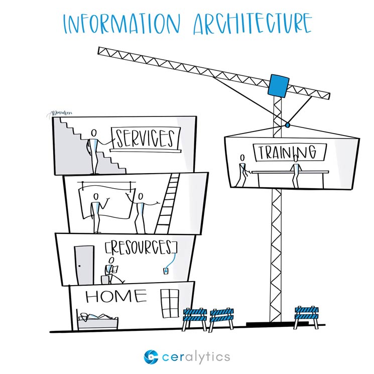
Information architecture is how your site is organized and labeled to enable visitors to find the information they’re after. Think of it in terms of the floors of a building. Your site is the full building, while the floors and rooms within each floor are various categories, sub-categories, and pieces of content.
A proper IA enables visitors to easily navigate your site from one area to the next, find (or even stumble upon) more valuable information they weren’t aware of, and give them a sense of where they are currently in the site.
Building your IA
Creating an IA involves a lot more than simply putting together navigation. Take this example:
If a product manager tells you that your company is selling three new products: ZippyDos, FraggleRicks, and Hoodyhays, your initial instinct may be to structure the information on your site like this:
- Our Products
- ZippyDos
- FraggleRicks
- Hoodyhays
But to someone who doesn’t know your company (or your weird naming schemes) these things make no sense at all. Imagine going into a store and taking the escalator up to the ZippyDos floor. What the heck is on the ZippyDos floor?
People won’t spend much time to figure it out either. They’ll just leave and go to a site that will give them clear answers.
A better IA would be more specific:
- Rain Wear
- Zip Up Rain Coats
- Lined Rain Coats
- Hooded Rain Coats
In the building that is your website, you have a Rain Wear floor. On that floor are rooms for each of those coats. This helps people easily navigate to the right floor and room to get what they want.
Now, this doesn’t mean you always forego using your brand names in navigation. Apple doesn’t have a navigation item for “Phones.” It has one for iPhone, because we all know what an iPhone is. If the name is common, or self-descriptive, it’s probably okay to use the product name in navigation.
Outside of products there will be many other options you can add to your site. Do you offer support? Do you think people will want to know about your management team? Do you want to include a search bar? All of these need to be factored into your IA.
IA and SEO
As you can see from the previous example, making pages clearer for end users also makes them clearer for search engines. A search engine doesn’t know what a ZippyDo is, but it will recognize what a Zip Up Rain Coat is.
Google also uses the context of where a page is within an information architecture to help it know how relevant the page is to the topic it claims to be about. An item like a bowling ball listing nested under “Rain Wear” wouldn’t make much sense to an end user or search engines.
This is what makes IA so important to SEO. If a site’s architecture isn’t clear, the confusion can lead to otherwise solid content not ranking at all for target keywords.
IA and content marketing
Delivering helpful content to end users is the name of the game in content marketing. But getting them to take another action on your site should be a driving goal of any content marketing program. You don’t want users to just read one post and leave.
This is where a deeper dive into IA takes place. You need to help users move from one post to another whenever possible to keep them engaged and even delight them with new content – like taking them deeper into the difference between pain points and solutions or showing them what SEO is NOT.
This is like opening up a secret tunnel to another room in the building that may be on a different floor, but it’s still related in the context of the piece of content. Like when someone’s reading about the best rain coats for cold weather and you link them to not only coats you have, but waterproof gloves too.
Tips for great IA’s
The human brain can hold 7 things in short-term memory (plus or minus two depending on the situation). So, when creating your information architecture, try not to present more than 7 options at a time to the user.
The brain also chunks data, so grouping similar things together helps readers easily jump past information they don’t need and hone in on the things they do.
Speak the users’ language. You can still use your brand and product names, but consider leading with layman’s terms first.
If you’re creating a new “floor” of content, it needs to have either 0 “rooms” or more than one “room” in it. For example, if you have a Resources section on your site and sub-categories below it, you can list it like this:
- Resources
- White Papers
- Webinars
But if your Resources section is just a blog and no other resources, this becomes redundant:
- Resources
- Blog
Instead, just name the page Resources or Blog. But don’t nest one inside the other.
Next Steps
Look at your current website, or the websites of your clients. Is the information architecture of the site clear to end users? If you’re on a specific page, can you easily deduce which section of the site you’re on?
If things aren’t clear, it might be time to take a step back and consider revising the IA for the site.
About Sketchalytics
Each week we send out a micro-lesson in marketing and/or business.
Our goal is NOT to give you best practices to go out and do what other people do. You can get that anywhere.
Instead, our goal is to give you knowledge that you can apply to your own organization to make the best decisions possible.
If you know anyone who you think would benefit from Sketchalytics, please feel free to share this with them so they can sign up.


